Trend Chart
Definition
Trend charts are also known as run charts, and are used to show trends in data over time. All processes vary, so single point measurements can be misleading.
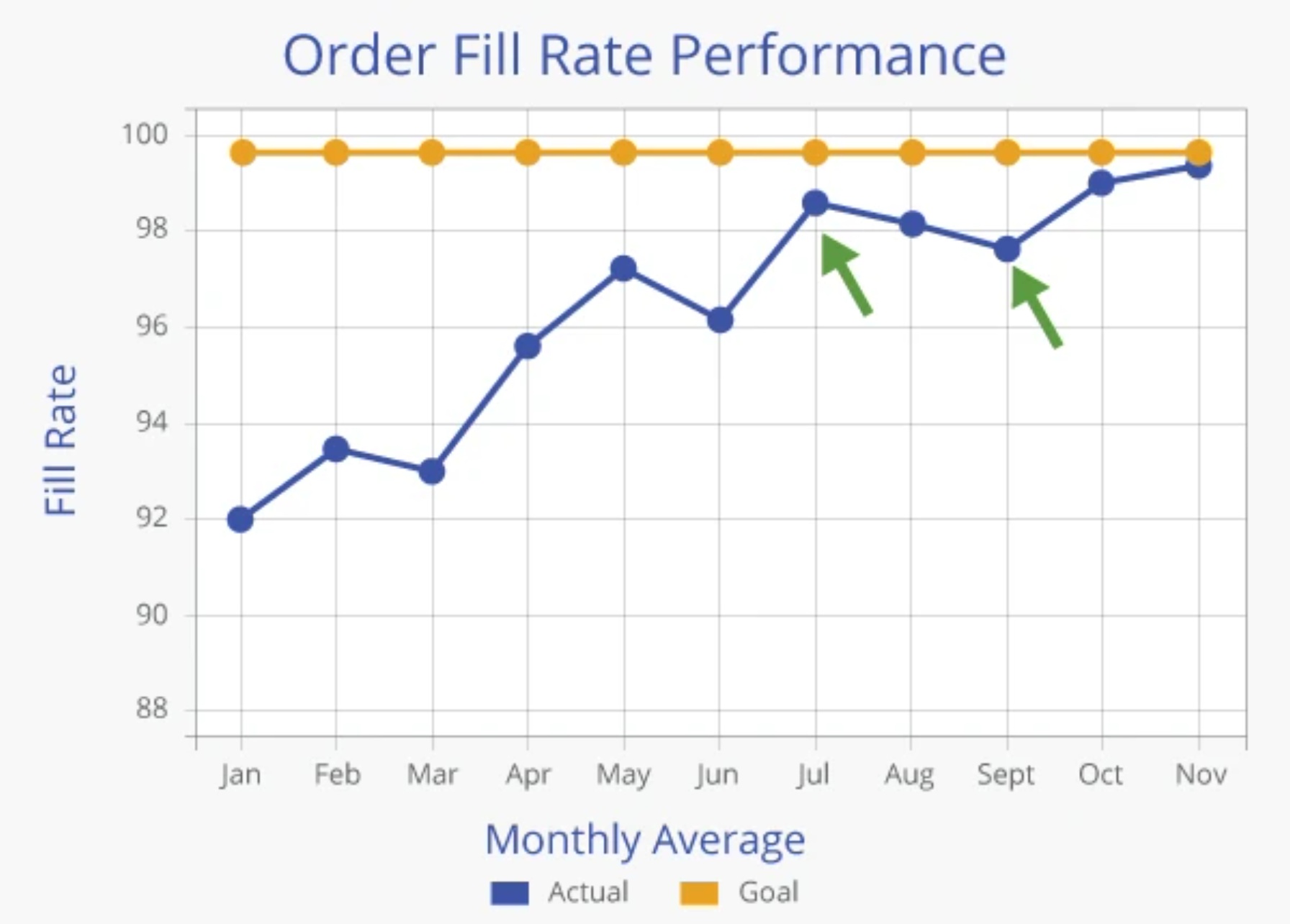
Displaying data over time increases understanding of the real performance of a process, particularly with regard to an established target or goal. Following is an example of a trend chart of order fill rate performance:
Major Elements of a Trend Chart
A good trend chart has the following characteristics:
- A clear Title to describe the subject of the chart.
- Labels on the vertical Y-axis and horizontal X-axis to describe the measurement and the time period.
- A Legend to differentiate the plotted lines - in this case, the actual vs. the goal.
- Appropriate Scales that are narrow enough to show variation.
- Limited Characteristics on each chart to avoid confusion from too many lines.
- An appropriate Time Frame.
- Notations on any major spikes.
- Targets or Goals should be noted on the chart for reference.
- Note Who Prepared the chart in case there are questions about the chart or the data.
Common Trend Chart Errors
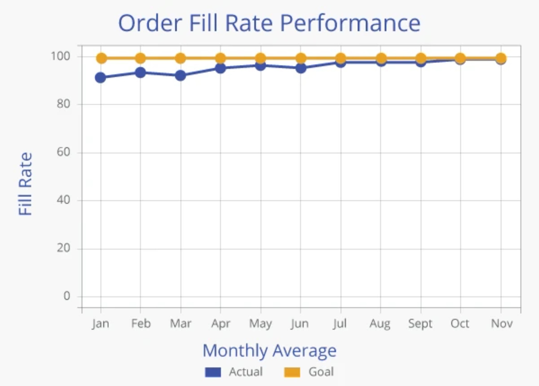
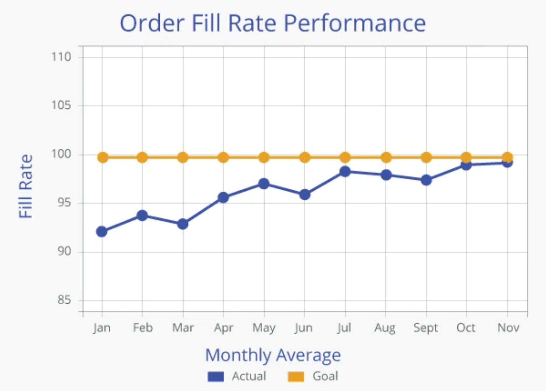
Two common errors in chart construction are shown below:
The first chart has a scale that is so wide that little variation can be seen. The data are correct (and are the same as in Figure 1 shown above), but the chart is not very useful because the scale is so wide (0-100%).
The second chart has a scale that includes impossible numbers based on the definition of the metric being charted. In this case, fill rate can not be higher than 100%, so a scale that goes to 120% is misleading. Again, this chart uses the same data as Figure 1 and 2, but conveys a different message.
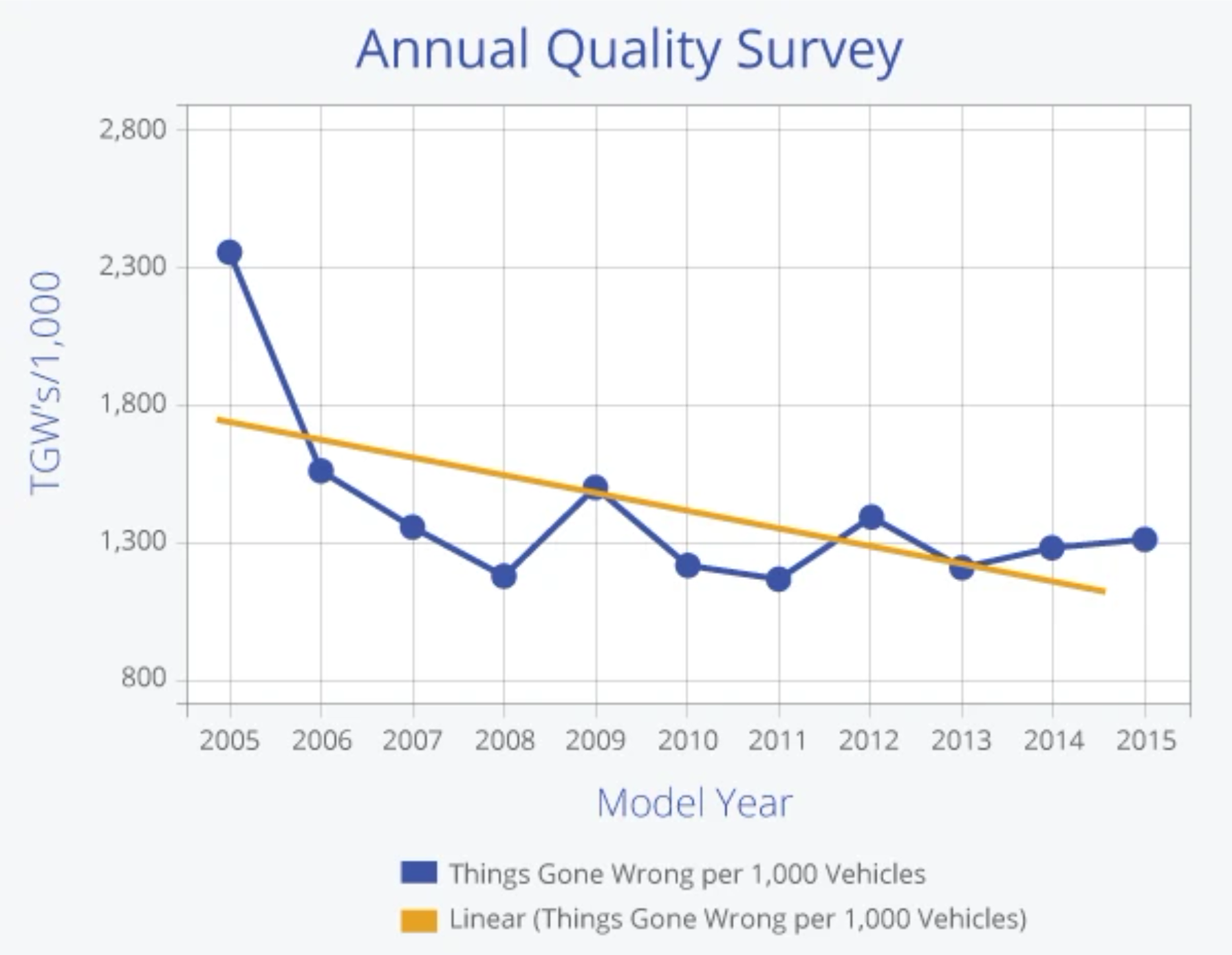
A third problem arises from using long time scales and inappropriate trend line plots. The MoreSteam editors know a Quality Manager at a major automobile manufacturer who was renowned for choosing time scales long enough to pick up an unfavorable baseline, and therefore indicate improvement in subsequent periods.
Sometimes this practice is helpful for a long term perspective, but it can be confusing if it diverts attention from more recent events - especially when a trend line is plotted through the data. Consider the following chart of quality complaints, or "Things Gone Wrong" (TGW's):
It is a fact that the TGW level in 1999 (1,320) is 44.5% lower than it was in 1989 (2,378). The trend line appears to indicate continuous improvement over time. However, the process is relatively stable since 1990, with little sustained improvement since that time, and an increase in TGW's over the last two years.
The presentation of the chart can tell two different stories, and the trend line is not appropriate in this instance. See the discussion below and Figure 6 on the use of reference bars.
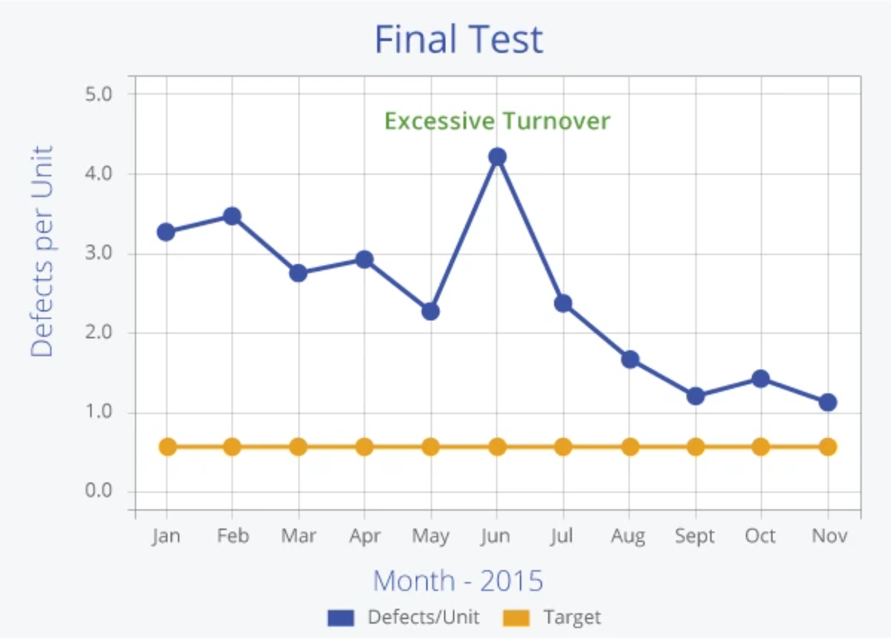
Many times a chart will exhibit an apparently abnormal fluctuation, or "spike", as seen in June of the chart below. Since such spikes always raise questions, a good rule of thumb is to pro-actively answer the question by putting a note on the chart as shown below. This practice also provides documentation of the history of a process and helps to connect cause with effect.
It is not always obvious when a "spike" occurs. Control charts use statistical rules to establish Control Limits that give indication of a statistically significant change in the process. See the Statistical Process Control section of the Toolbox for a tutorial on Control Charts.
MoreSteam Reminder: When ever you use data to make decisions, remember to question the quality of the measurement. A well-constructed chart made with poor quality data is not a valuable tool. If you are unfamiliar with Measurement System Analysis, see that section of the Toolbox for a tutorial on the subject.
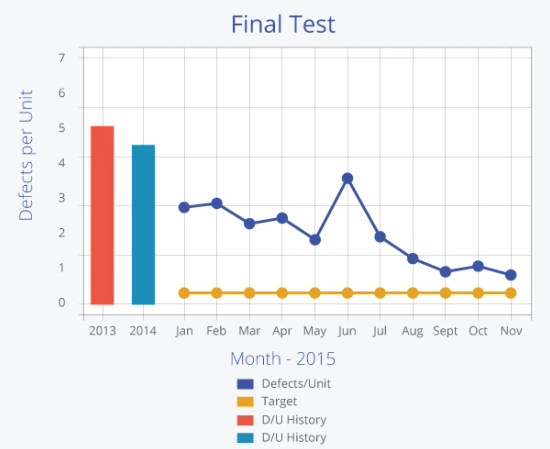
A further improvement to aid understanding of a trend chart is to add Reference Bars. The chart below is the same as that represented by Figure 5, but has reference bars added to show the performance in prior years. The addition broadens the reader's perspective by showing the extent of improvement over a longer time horizon.
Choosing the Right Trend Chart Software
A clear picture of how a process is performing means representing data in a way that accurately reflects trends over time and moves problem-solving work beyond “noisy” outliers. With EngineRoom’s Trend Chart tool, performance trends can be visualized no matter how simple or complex the data set.
Using the Trend Chart tool inside EngineRoom begins with seamlessly importing one or more data sets, which populate a chart that automatically adjusts the X and Y axes based on the range of data received. For clarity’s sake, it’s possible to edit line colors and other visual features on the chart and add a target value to gauge how close a process is to a goal quickly. When dealing with multiple variables (e.g., process performance across different manufacturing plants), the tool has a simple drag-and-drop interface that helps users visualize all of them simultaneously - with an average just a click away. With EngineRoom’s Trend Chart tool, it’s easy to avoid the many pitfalls of data visualization and begin diagnosing process problems with accuracy and insight.
Checkout the detailed tutorial below that shows how to use the Trend Chart Tool in EngineRoom:
Summary
Using a trend chart enables process improvement teams to identify changes in process outputs over time. The chart can be used as a measurement tool to understand how a process is currently performing and also to track any changes in the process over time.
