If You Learn One Statistical Tool for Process Improvement, Make It Control Charts
April 1, 2025Most process improvement professionals recognize Statistical Process Control (SPC) as a cornerstone of quality control in manufacturing. But if you think SPC is just for the factory floor, you’re missing out on one of the most powerful and versatile toolsets for making better decisions.
SPC is made up of several tools that help teams analyze, measure, and validate how a process is performing. Among these tools, control charts (or process behavior charts), are the most essential. They help teams cut through process noise, detect meaningful shifts, and avoid reacting to normal variation as if it were a problem. Control charts provide the visibility needed to understand when a process needs attention and, just as importantly, when it doesn’t.
While SPC is sometimes referred to as Statistical Quality Control (SQC) and includes a range of methods, control charts remain the primary tool for monitoring stability and identifying significant changes in process performance.
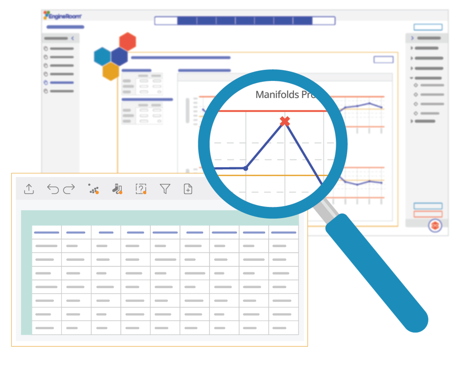
When data lives only in spreadsheets, it can be hard to see what’s actually happening. A control chart turns that data into something more readable.
What is a Control Chart?
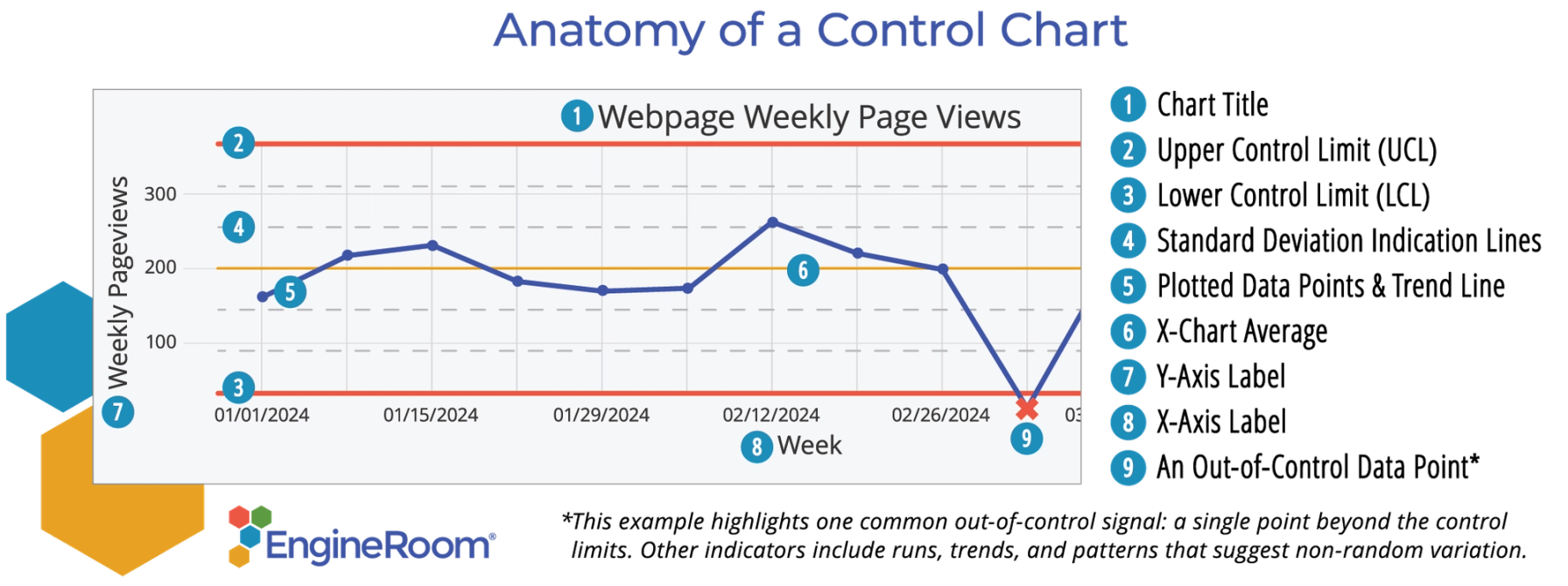
A control chart is a graphical tool that monitors how a process performs over time. It includes a centerline for the average and upper and lower control limits, set at three standard deviations from the mean. When data points fall inside the control limits and follow a random pattern, the process is considered stable. Points outside the limits — or unusual patterns within them — signal that something may have changed. This can help signal when teams should take action. Learn More about Control Charts
Control Charts: The Tool That Keeps You Focused on What Matters
Process variation is inevitable, and not all of it requires action. The real challenge is knowing the difference between routine noise and a true process shift that demands intervention.
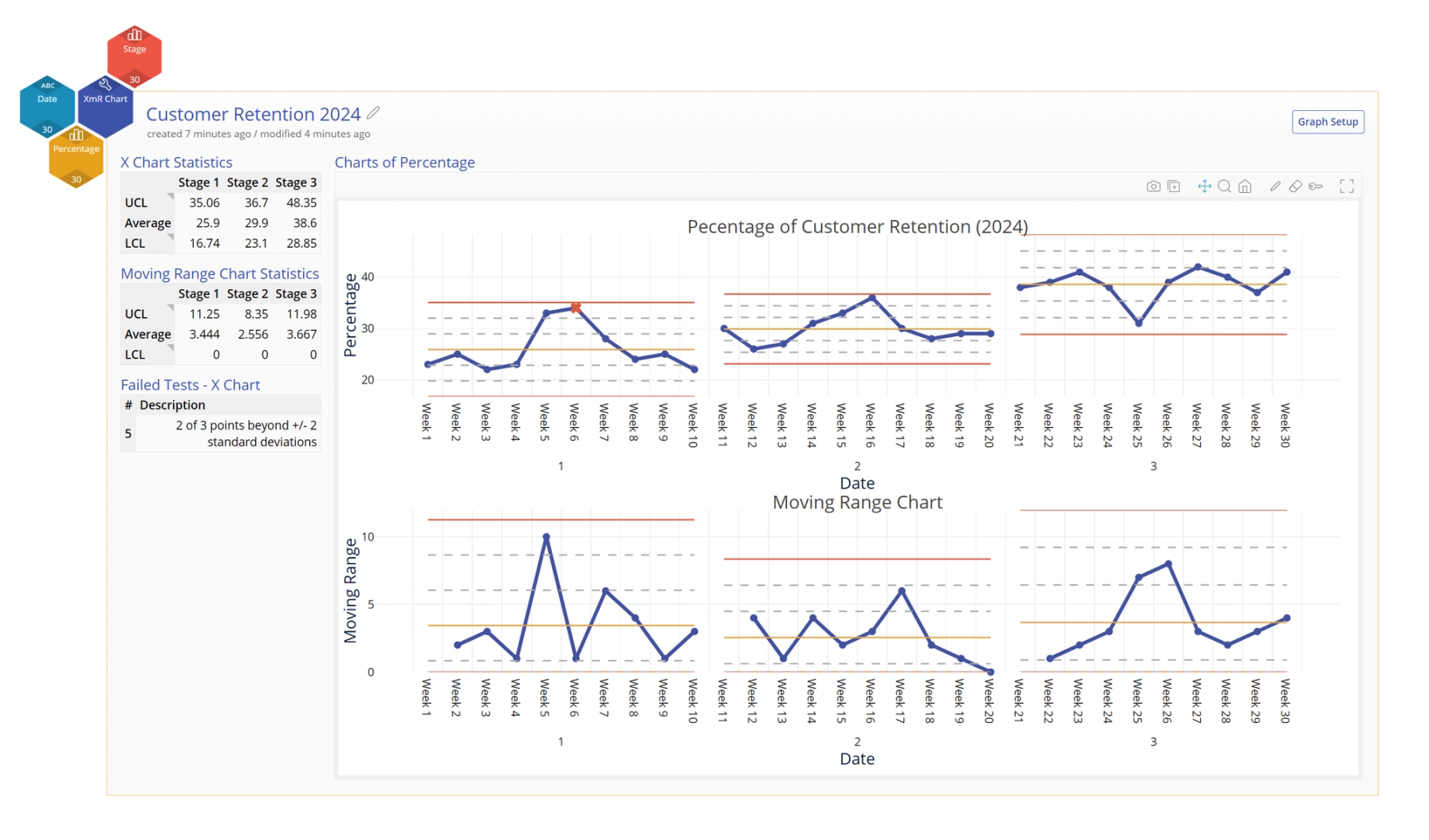
Take marketing, for example. Before launching a digital ad campaign, we establish a baseline for key metrics like webpage weekly views, time spent on page, and click-through rates. All of those metrics vary naturally from day to day. Once the campaign is live, we use XmR charts (a type of control chart) to track changes over time. If engagement shifts beyond the expected limits (#9 in the chart above), we dig into the data to determine whether the change is due to an assignable cause—like our campaign. If it is, we can respond strategically and make informed, data-backed decisions.
Control charts are a powerful part of SPC because they bring clarity to process variation. Without it, teams may misinterpret trends, respond to normal variation as if it were a real issue, or miss important process shifts. These missteps lead to wasted effort, false alarms, and missed opportunities. When applied correctly, control charts help ensure that changes are made for the right reasons.
With the right control chart you can do more than just track data, you can build trust in your metrics, uncover meaningful patterns, and make decisions with purpose and precision.
Why Control Charts Belong in Every Process Improvement Toolbox
Control charts aren’t just a way to monitor data; they’re a foundational tool within Statistical Process Control (SPC) for understanding process behavior and driving continuous improvement. Here’s why they’re essential for any process improvement professional:
- Promote process consistency. Control charts were originally developed to keep manufacturing processes stable and predictable. Today, they still serve the purpose of providing a clear visual check that a process is operating within expected limits helping to sustain quality over time.
- Turn raw numbers into clear insights. Control charts visualize process behavior, making it easier to spot trends and patterns so decision-makers don’t have to rely on guesswork or gut feelings.
- Applicable to any industry. Whether tracking customer satisfaction, improving hospital wait times, or refining supply chain operations, control charts provide the same structured approach to understanding and improving performance.
- Straightforward to learn and easy to use. Once the basics are understood, control charts can be applied quickly by teams without deep statistical backgrounds.
Let’s look at some real-world applications of SPC and how different industries use control charts to drive improvement.
How to Apply Control Charts in Process Improvement
Control charts are one of the most practical and powerful tools within Statistical Process Control (SPC), giving teams a clear, visual way to understand process behavior.
5 Key Steps to Using Control Charts Effectively
- Collect data consistently – Identify a key process metric and track it over time to establish a reliable baseline.
- Choose the right control chart – The right chart depends on the type of data you’re working with (e.g., counts, proportions, or measurements).
- Plot data and set control limits – Establish control limits using historical data—three standard deviations from the mean—to detect normal vs. abnormal variation.
- Analyze variation – Look for patterns, shifts, or points outside of the control limits that may indicate a process change.
- Take action when needed – Investigate special cause variation and make targeted improvements, while avoiding overcorrections for normal process noise.
Let’s dig into step 2: Choosing the right control chart. Different charts are built for different kinds of data and variation. Understanding those distinctions can help you choose the right tool for the job, opening the door for applying control charts effectively and for different use cases.
SPC Charts in Action: Industry Applications & Types of Control Charts
XmR Chart: Tracking Support Ticket Resolution in Software Development
Definition: An XmR (Individual Moving Range) chart tracks variation in single observations over time, helping identify trends and shifts. It's one of the most versatile control charts and often a good starting point when you're unsure which type to use.
Example: A tech company monitors support ticket resolution times. If response times spike, is it just a temporary workload increase, or a sign of deeper inefficiencies? An XmR chart helps pinpoint whether the slowdown is routine or signals a real problem that requires action.
p Chart: Tracking Rejected Loan Applications in Financial Services
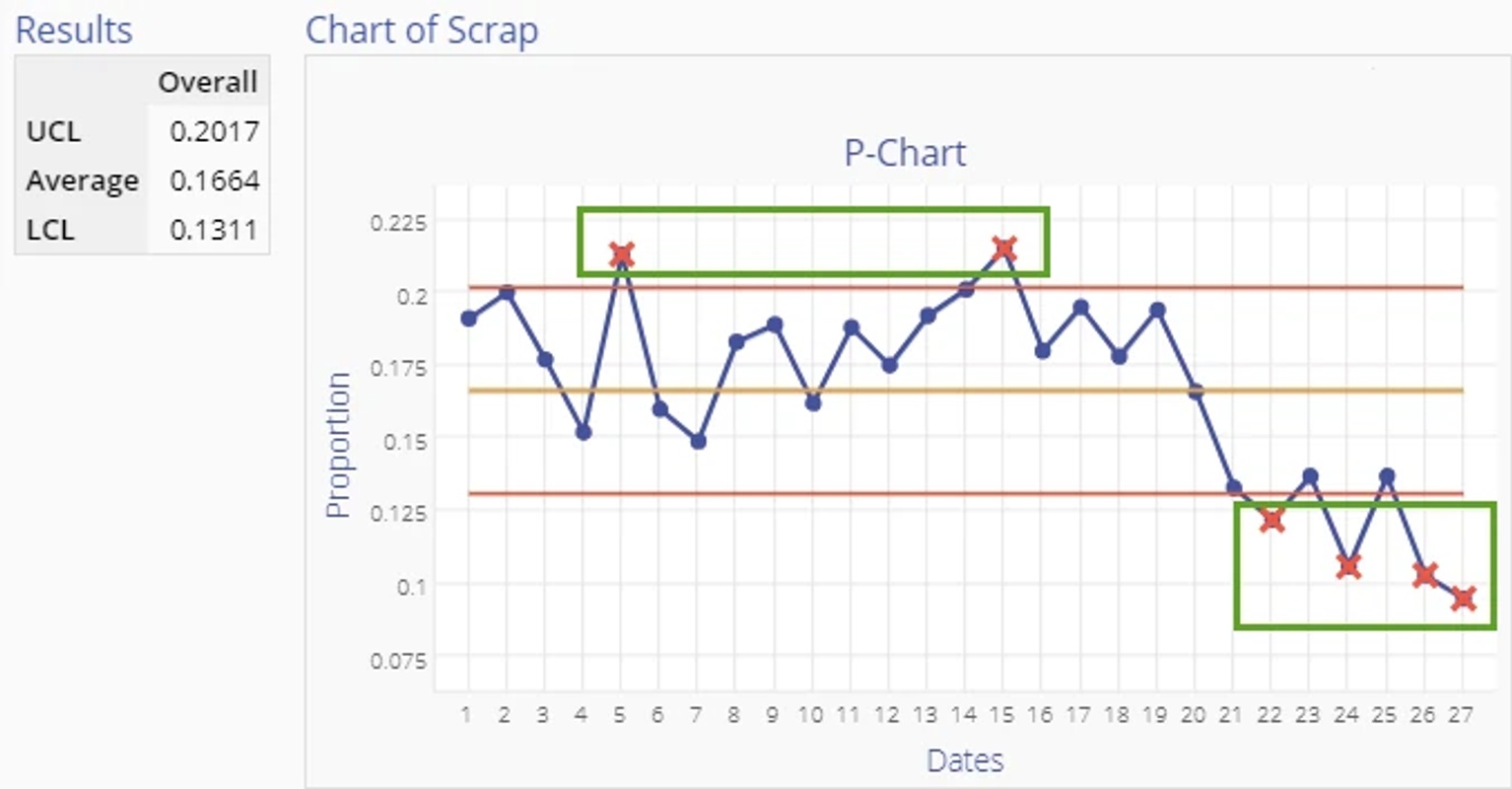
Definition: A p-chart monitors the proportion of defective outcomes in a process, making it ideal for tracking error rates over time.
Example: A financial institution tracks loan rejection rates. If denials suddenly spike, control charts help determine whether it’s a random fluctuation or an issue with the application process, like missing documentation or changes in approval criteria.
c Chart – Identifying Process Issues in a Restaurant Kitchen
Definition: A c chart requires a constant sample size and tracks the total count of defects when the opportunity for defects stays constant.
Example: A restaurant chain monitors order accuracy across multiple locations per 100 meals. If one location consistently has more incorrect orders, a c chart can alert you to this, allowing you to dig into the root cause and determine if the issue is training-related, supply chain-driven, or tied to staffing shortages.
u Chart – Tracking Flight Delays in Aviation
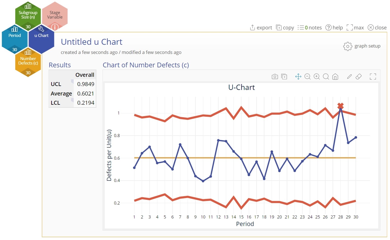
Definition: A u chart monitors defect rates when sample sizes vary, making it ideal for fluctuating demand.
Example: Airlines face constant disruptions from weather, crew availability, and air traffic congestion. A u chart tracks delayed flights relative to total scheduled flights, helping identify seasonal patterns and operational bottlenecks so airlines can proactively reduce delays.
Beyond these common control charts, SPC has specialized tools to tackle different process challenges:
- np Chart – Tracks the actual count of defective items instead of a proportion.
- g Chart – Monitors time between rare events, such as medical safety incidents or equipment failures.
- CUSUM Chart – Detects small, sustained shifts in a process over time.
- Exponentially Weighted Moving Average (EWMA) Chart – Smoothes out short-term fluctuations to highlight long-term trends.
- Multivariate Control Chart – Tracks multiple process variables simultaneously to uncover complex system interactions.
Overcoming SPC Challenges with EngineRoom
SPC is a powerful tool, but many organizations struggle with data interpretation, statistical complexity, resistance to adoption, and lack of training. EngineRoom, MoreSteam’s cloud-based process improvement platform, helps overcome these hurdles by simplifying SPC applications and making statistical analysis more accessible.
How EngineRoom’s Control Chart Capabilities Address Common Barriers
Misinterpreting Control Charts and Overreacting to Variation
Teams sometimes misread control charts or mistake normal variation for something that needs fixing. EngineRoom offers guided analysis, interactive wizards, and support from AI assistant “Hexie” to help users select the right chart and interpret results with confidence.
Lack of Training and Statistical Background
Many people hesitate to use control charts because they assume statistical knowledge is required. EngineRoom includes tutorials, templates, and built-in coaching to help users apply control charts accurately, even without advanced training.
Management Buy-In and Integration into Daily Operations
EngineRoom creates visually engaging, easy-to-export control charts that simplify communicating process behavior to stakeholders. This helps secure management buy-in and reduces barriers for teams integrating control charts into daily operations.
Complex Software Interactions
EngineRoom’s drag & drop interface treats data variables as visual objects rather than numbers buried in a spreadsheet. By eliminating complex menu interactions, building a control chart is quick and easy, which reduces the barriers to adoption.
Control Charts + EngineRoom: Clearer Insights, Better Decisions
Control charts are one of the most effective tools for understanding and improving processes. They help you see what’s truly changing and avoid reacting to everyday variation. With control charts, you can make data-driven decisions that move your team forward with confidence.
EngineRoom makes it easy to apply control charts without the complexity. The platform helps you select the right chart, set it up quickly, and interpret your data with clarity. This empowers your team to take action based on what really matters.
Control charts should be an essential part of every process improvement toolkit. With EngineRoom, you’ll have the tools and guidance to make better decisions, faster.
Ready to take control charts from theory to practice?

Marketing Analyst & Creative Lead • MoreSteam
Emily joined MoreSteam in 2021, bringing a versatile background in advertising, marketing, and front-end web development. Since then, she’s found a passion for data analysis and continuous improvement, spending her days digging into analytics to uncover insights that drive smarter marketing strategies and better user experiences. A graduate with academic honors from The Art Institute of Pittsburgh, Emily combines creative design thinking with a data-informed mindset to support continuous improvement in both her professional work and personal growth.
