
Multi-Vari Chart Tutorial
When to use this tool
A Multi-Vari Chart is a powerful visual tool used to analyze variability in a process across multiple factors. This chart helps identify patterns and sources of variation by displaying data in relation to different categories or conditions, such as time, machine, operator, or location.
Whether you're troubleshooting a problem, validating a process change, or just trying to understand what's driving fluctuations in your results, a Multi-Vari Chart provides an intuitive way to see how multiple variables interact.
How to use this tool in EngineRoom
The Multi-Vari Chart uses categorical variables as input variables and one numeric variable as the response variable.
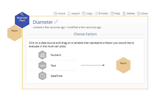
To use the Multi-Vari Chart, select the Measure menu > Basic Graphs... > Multi-Vari Chart. The tool opens in the workspace:
Example:
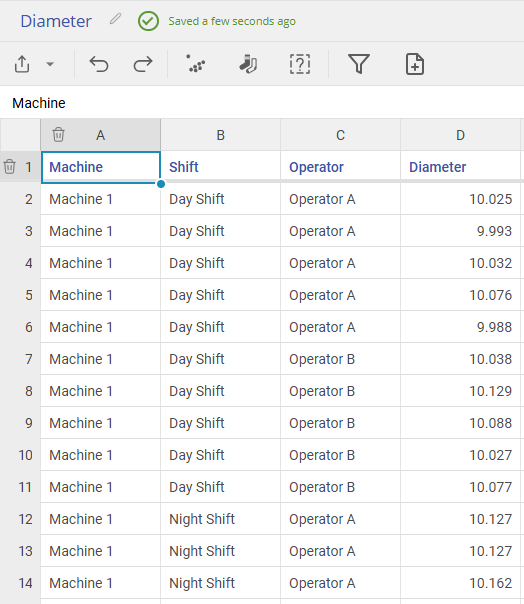
A manufacturing company is investigating variability in the diameter of plastic tubing produced on different machines. They suspect that the variation could be influenced by three key factors:
Machine (Factor A) – Tubing is produced on one of three machines: Machine 1, Machine 2, and Machine 3.
Shift (Factor B) – Production runs on two shifts: Day Shift and Night Shift.
Operator (Factor C) – Each shift has different operators: Operator A and Operator B.
Steps:
1. Open the Multi-Vari Chart tool onto the workspace.
2. Click on the data source and drag Machine, Shift, and Operator onto the Factor drop zone.
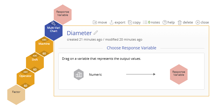
3. Drag Diameter onto the Response Variable drop zone.
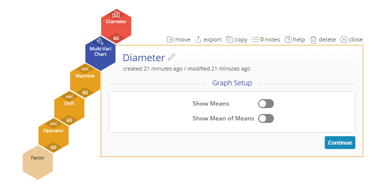
4. (Optional) Select "Show Means" or "Show Mean of Means" to get additional information displayed on the screen.
5. Click “Continue.”
The ouput shows points representing the first factor, and separate lines for each of the second factor, and groups for the third factor. If you add a fourth factor, then it will appear as different pages.
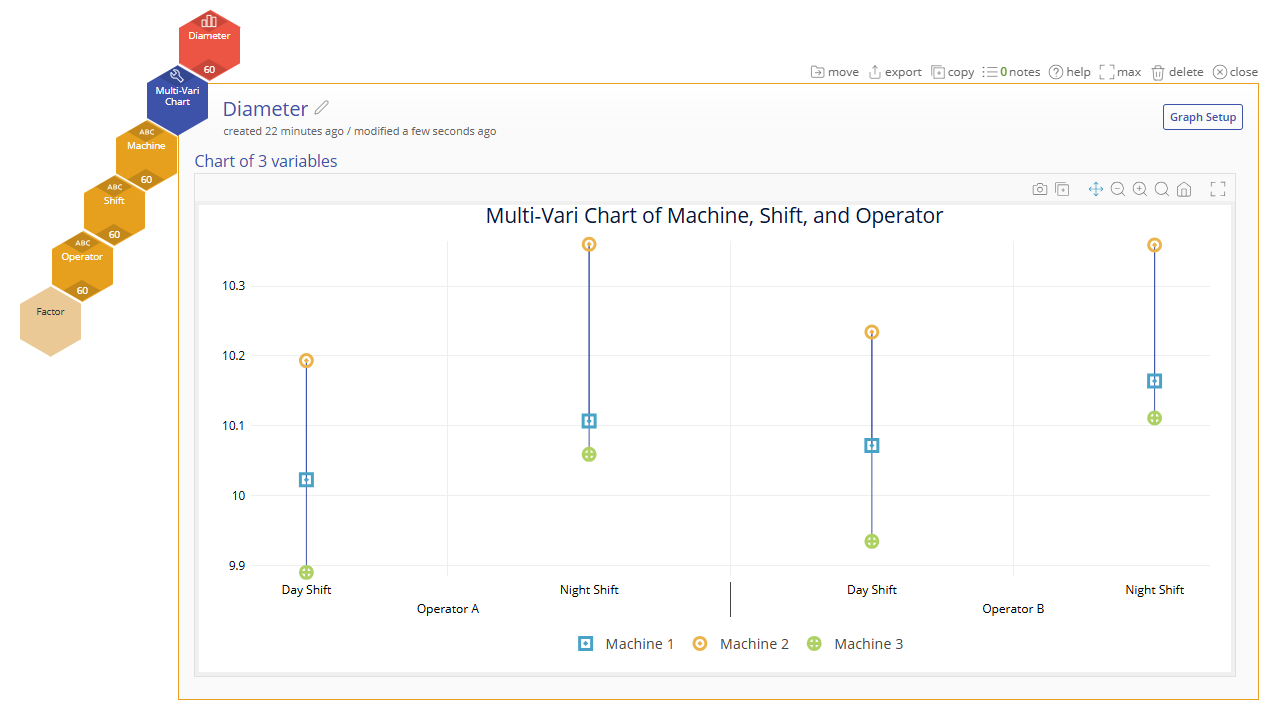
In this example, the Multi-Vari Chart shows that Machine 2 consistently produces larger diameters than the others, especially during the Night Shift. Operator B tends to produce slightly larger parts than Operator A across all machines and shifts. The largest variation appears to occur between machines, indicating equipment may be the dominant source of variation.
Multi-Vari Chart Video Tutorial
Coming Soon
Was this helpful?