
Response Surface Methods (RSM) Designs
Response Surface Methods (or RSM) designs are used to model complex relationships between a set of continuous independent variables and a continuous response variable, in order to optimize operating conditions to produce consistent and optimal results. This advanced design builds out non-linear models, providing detailed interaction effects and contour plots. In addition, models can be pushed to a Response Optimizer to find target, maximum, and minimum results.
When to use this tool
Use Response Surface Methodology (RSM) designs when the goal is to model curvature in the response surface and find the peaks (maximize), valleys (minimize) or 'flats' (areas of robustness) of the surface in order to optimize the response.
An Example Using EngineRoom
Example:
We will use the following example to demonstrate the use of RSM designs: An engineering team at a precision tool manufacturing company has developed a working prototype of a new cutting tool and wants to study two factors in order to ensure the cut dimension is on target and the variability around the target is minimized:
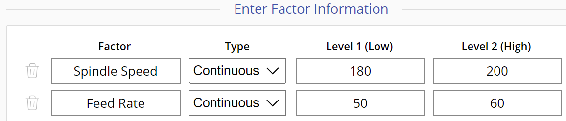
Spindle Speed: Low=180, High=200 Feed Rate: Low=50, High=60
The team decides to study the effects of the two factors using a Central Composite Design (CCD), the most common type of RSM, to account for curvature in the relationships.
Steps:
To run the RSM design, follow these steps:
1. Create the Design
- Open the DOE tool: Analyze > Design of Experiments > DOE
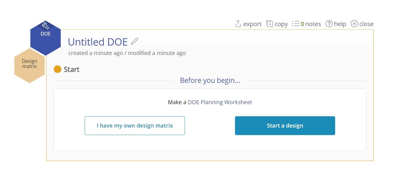
- Select Start a design
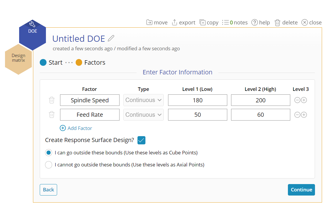
- Enter the names and low and high levels of the factors. Note: all factors must be continuous.
- Click the checkbox for Create Response Surface Design
- The RSM design will explore an area beyond the nominal ‘low’ and ‘high’ levels of the factors, so select these levels with some space to spare, if possible. Otherwise, if the ‘low’ and ‘high’ levels for the factors are strict bounds (i.e., you cannot operate the factors beyond these levels), then check the box ‘I cannot go outside these bounds’. In this example the design can go beyond the levels entered, so leave the default option ‘I can go outside these bounds’ checked:
- Click Continue
- Complete the settings for the design as shown below. Note that the power displayed applies only to the factorial (cube) portion of the design so the overall power of the RSM could be higher.
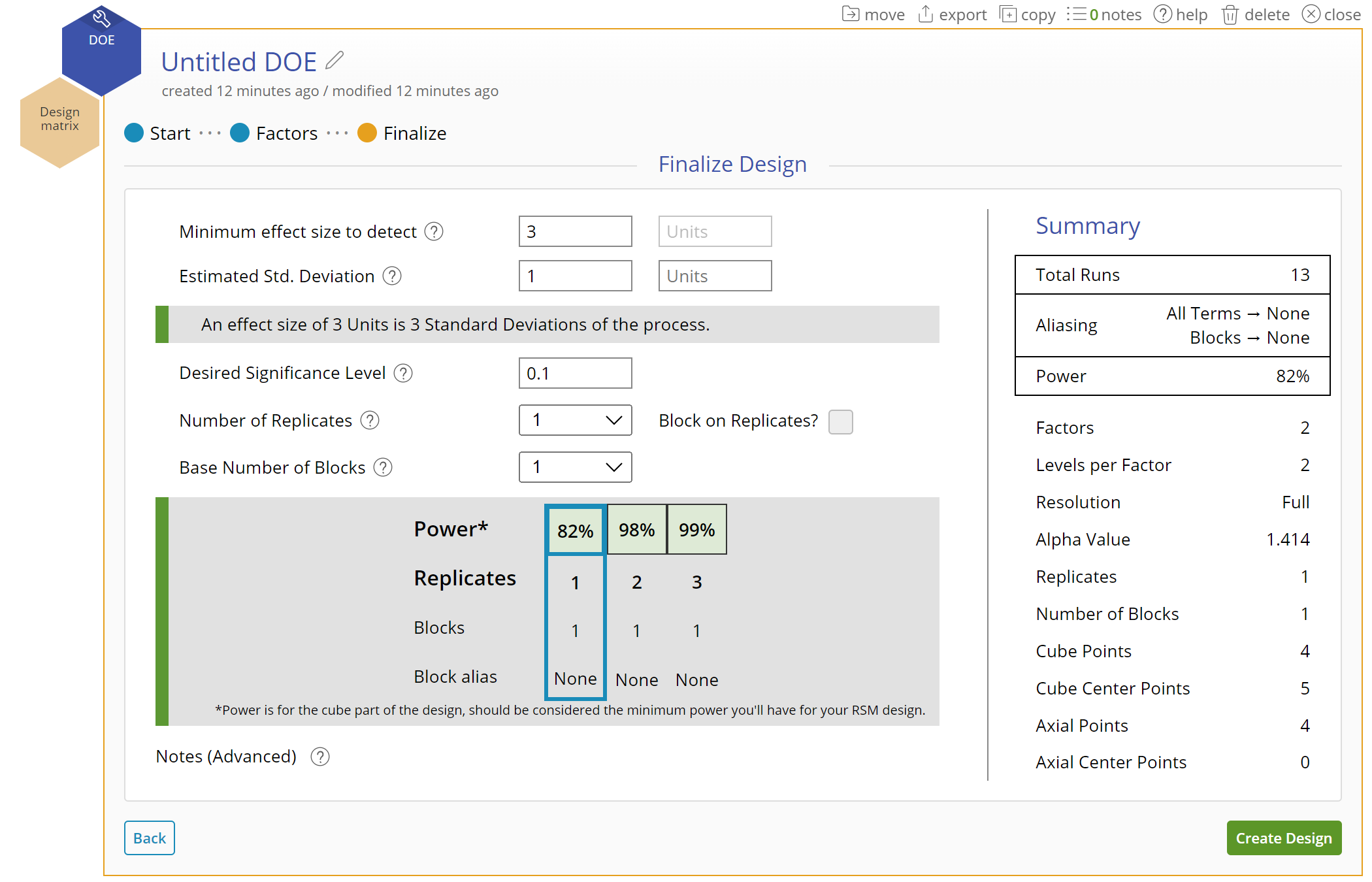
The design has 4 cube points (factorial runs), 5 center points and 4 axial points, for a total of 13 design runs. We will run a single replicate of the design.
- If you need to change the design at this stage, click on the navigation across the top or on the Back button; once you create the design matrix, you will not be able to change the design.
- Click Create Design
2. Enter the Data
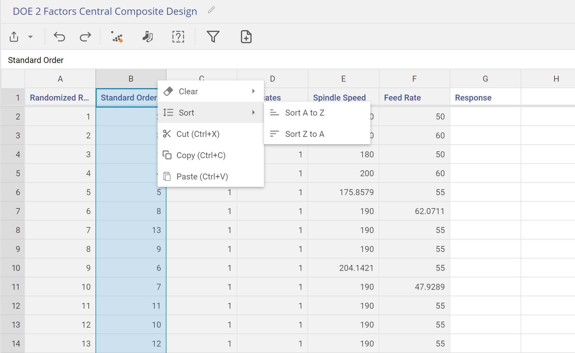
- The design matrix opens up from the data sources panel. It contains all the information about the design, with blank columns at the end where you can enter data from one or more response variables. Normally you would run the experiment by following the Randomized Run order; however, because the response data are provided in the data sheet in the Standard Order, organize the table in the Standard Order so you can copy-paste the data in.
- To do this, right-click on the Standard order column, and select Sort > A -> Z
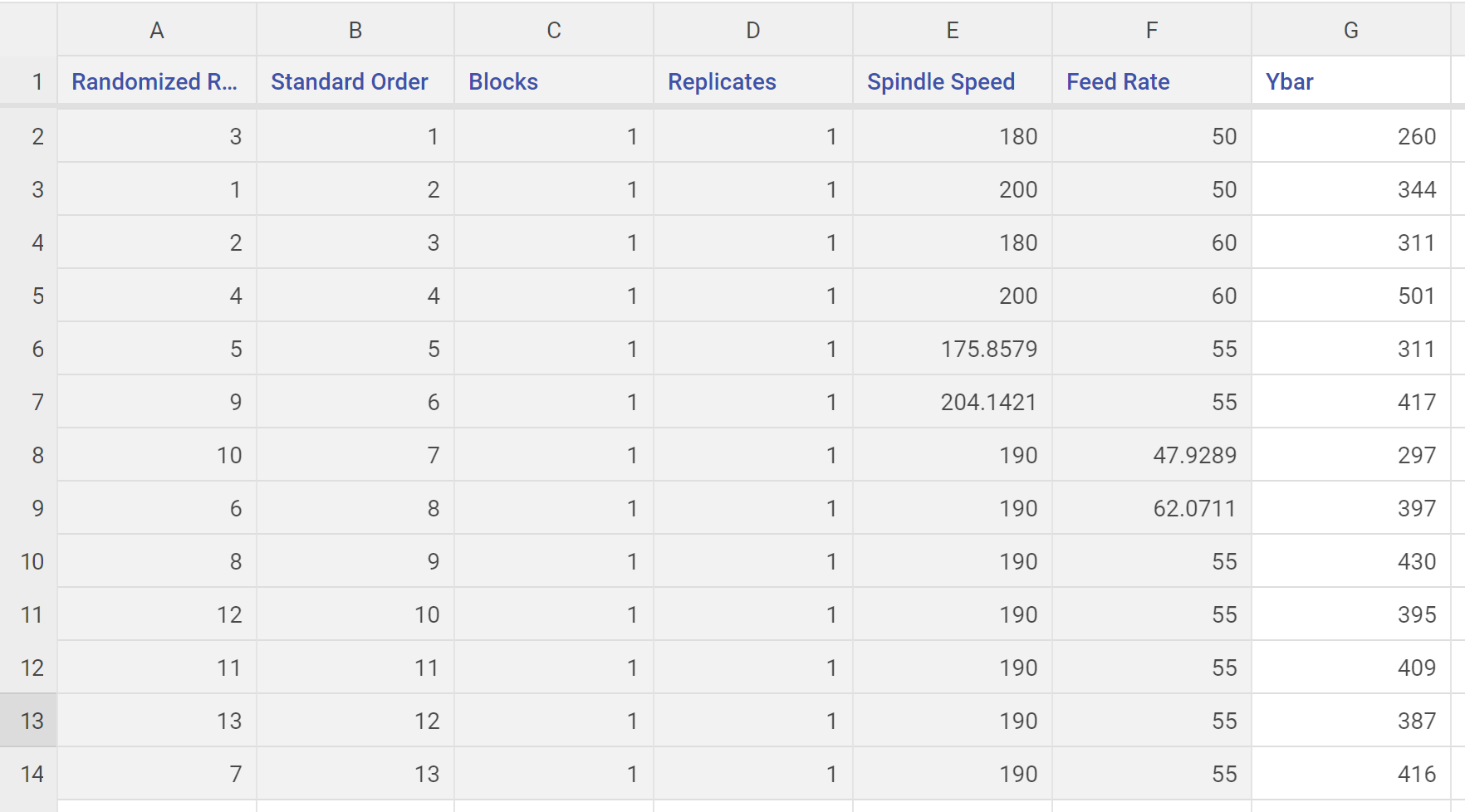
- Copy-paste the response data from the data sheet provided into the blank columns to the right of the sorted RSM design and click the "save and close" button on the top right of the data source
3. Analyze the Design
For this example, we will only analyze the Ybar response. To analyze the design, follow these steps:
- Use the same DOE tool used to create the design matrix. If the design was created at a different time and the original DOE study is no longer available, open a new DOE study (Analyze > Design of Experiments > DOE), then click ‘I have my own design matrix’)
- Click on the data source in the left panel containing the RSM design and response data
- Drag the Design matrix variable from the data sources panel onto the Design matrix drop zone on the DOE study, and the Ybar response variable onto the Response Variable drop zone. Click Continue.
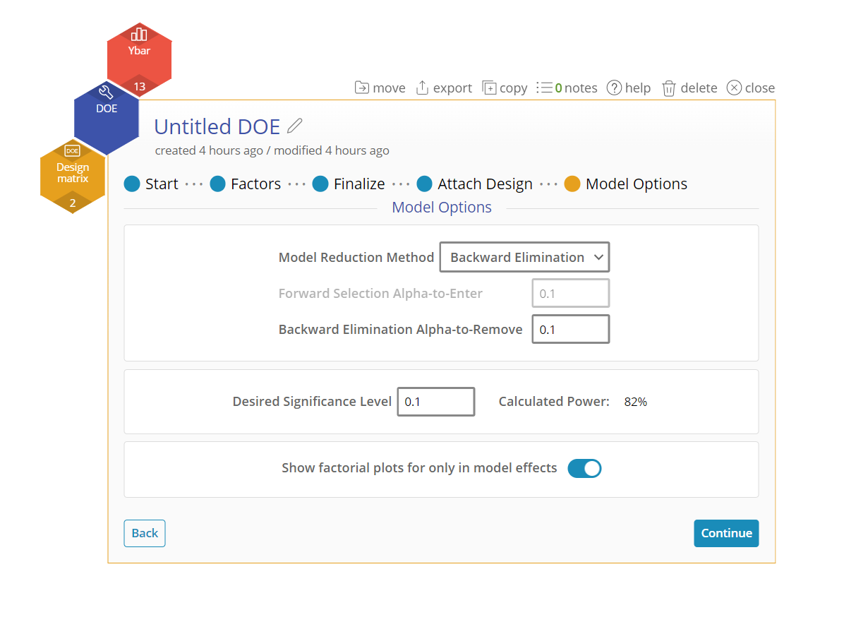
- Select one of the model reduction methods from the menu, or use manual reduction to build the model with only the significant terms included. We will use Backwards Elimination with an alpha value of 0.1.
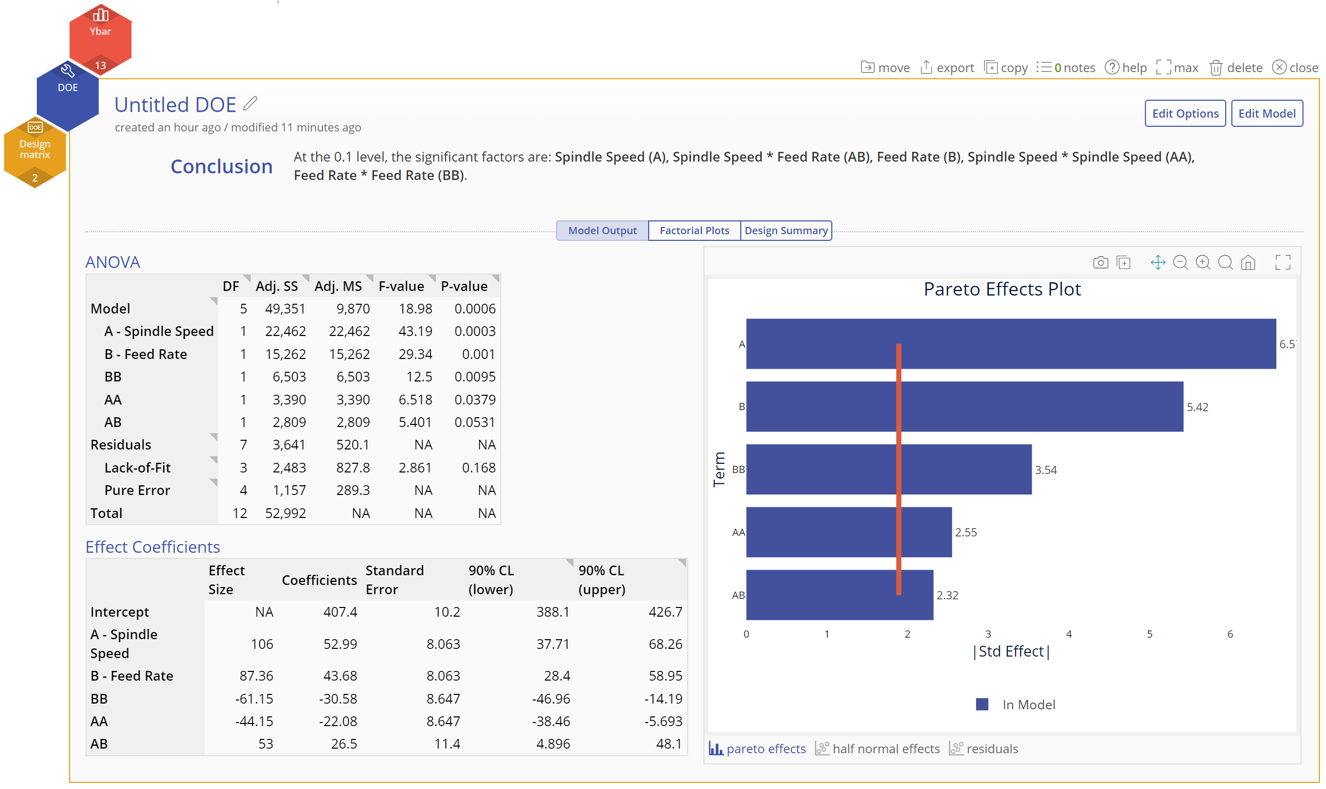
4. Interpret the Output The final model includes all the terms, making it a full quadratic model: A, B, AA, BB and AB. The Conclusion statement at the top tells us that all the terms are significant at the 10% alpha level. Below that, the output screen is shown across 3 tabs.
- Model Output tab:
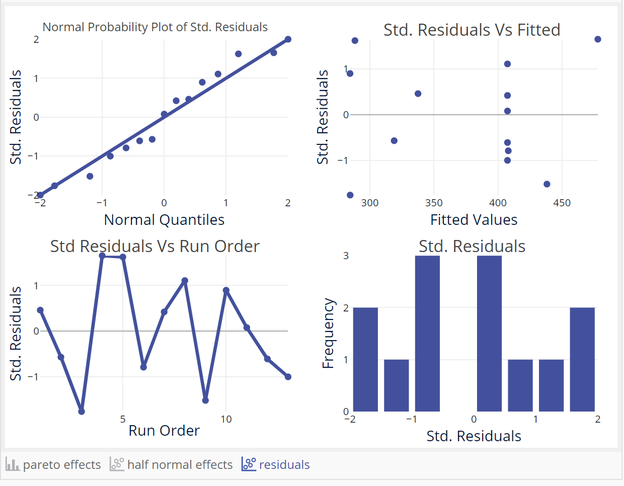
This screen shows the full numeric output along with graphs on the right including a Pareto Effects plot, Half Normal effects plot and the Residual plots
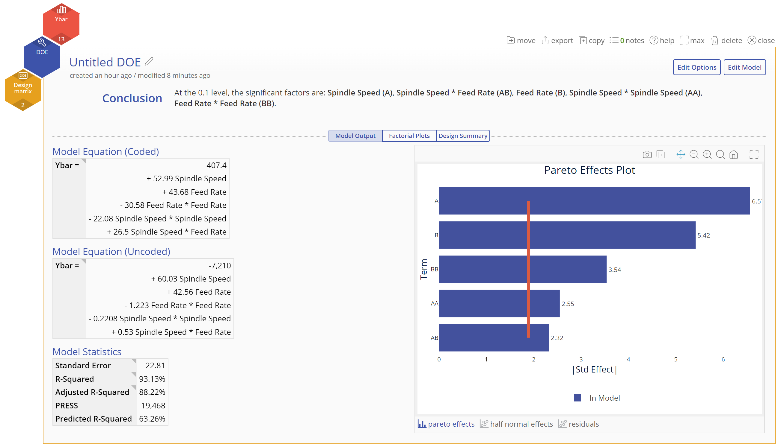
Scroll down the left side to see the full numeric output
Click on the link below the Pareto plot to see the Residuals plots:
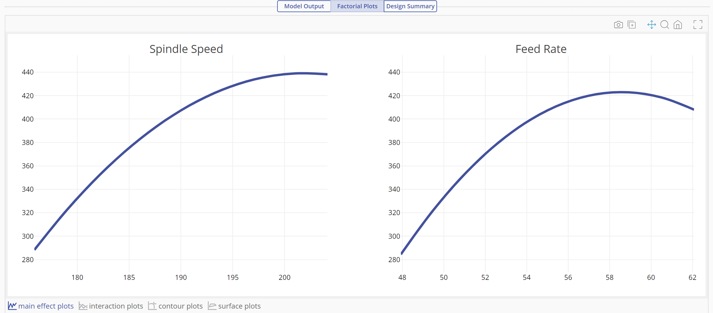
- Factorial Plots tab This tab shows the effects in graphical format. The main effect plots for Spindle speed and Feed rate show their nonlinear effect on Ybar:
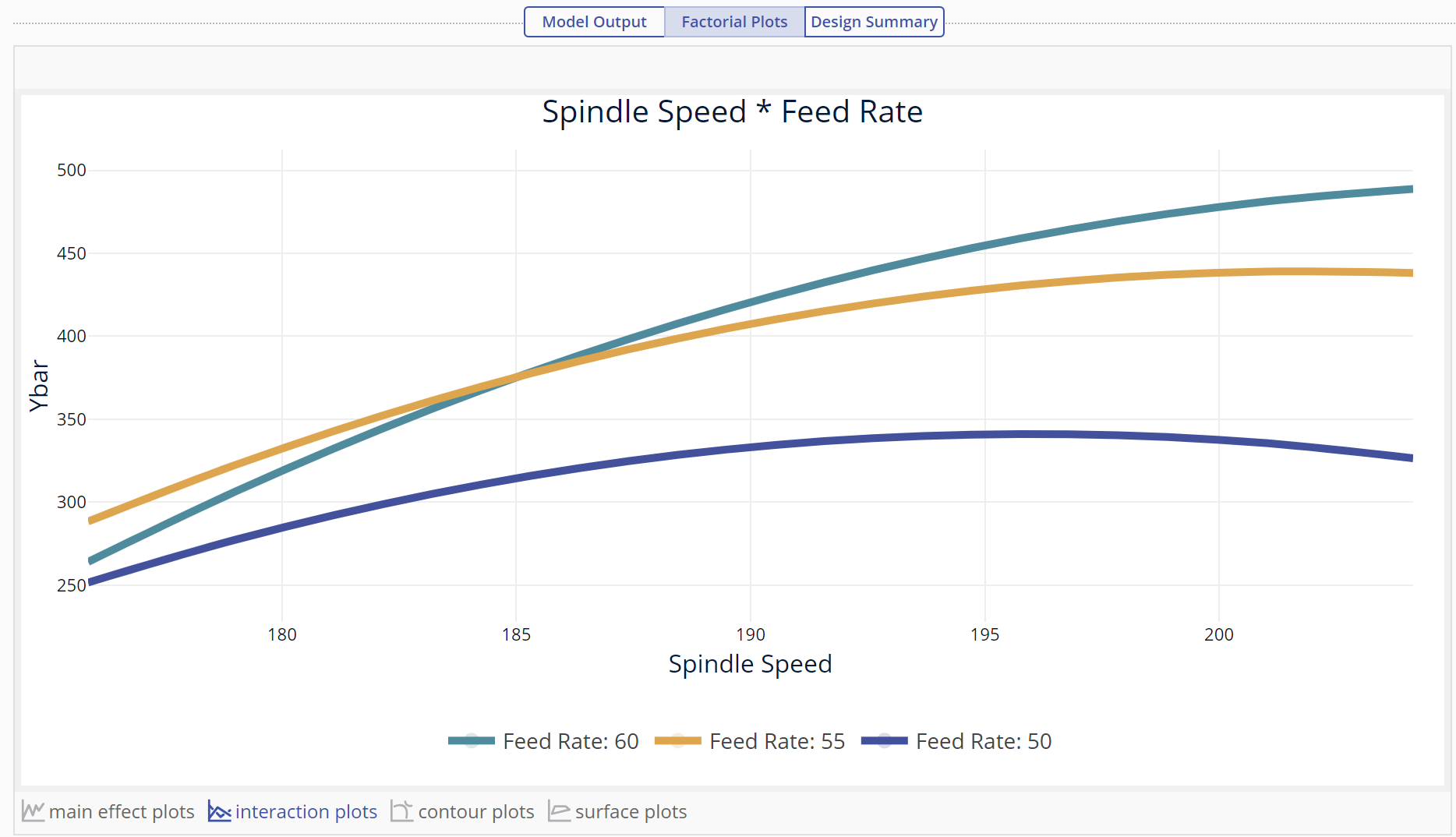
Click on the interaction plots link below the main effects to get the interaction plot:
Click on the contour plots link to see the interaction as a contour plot:
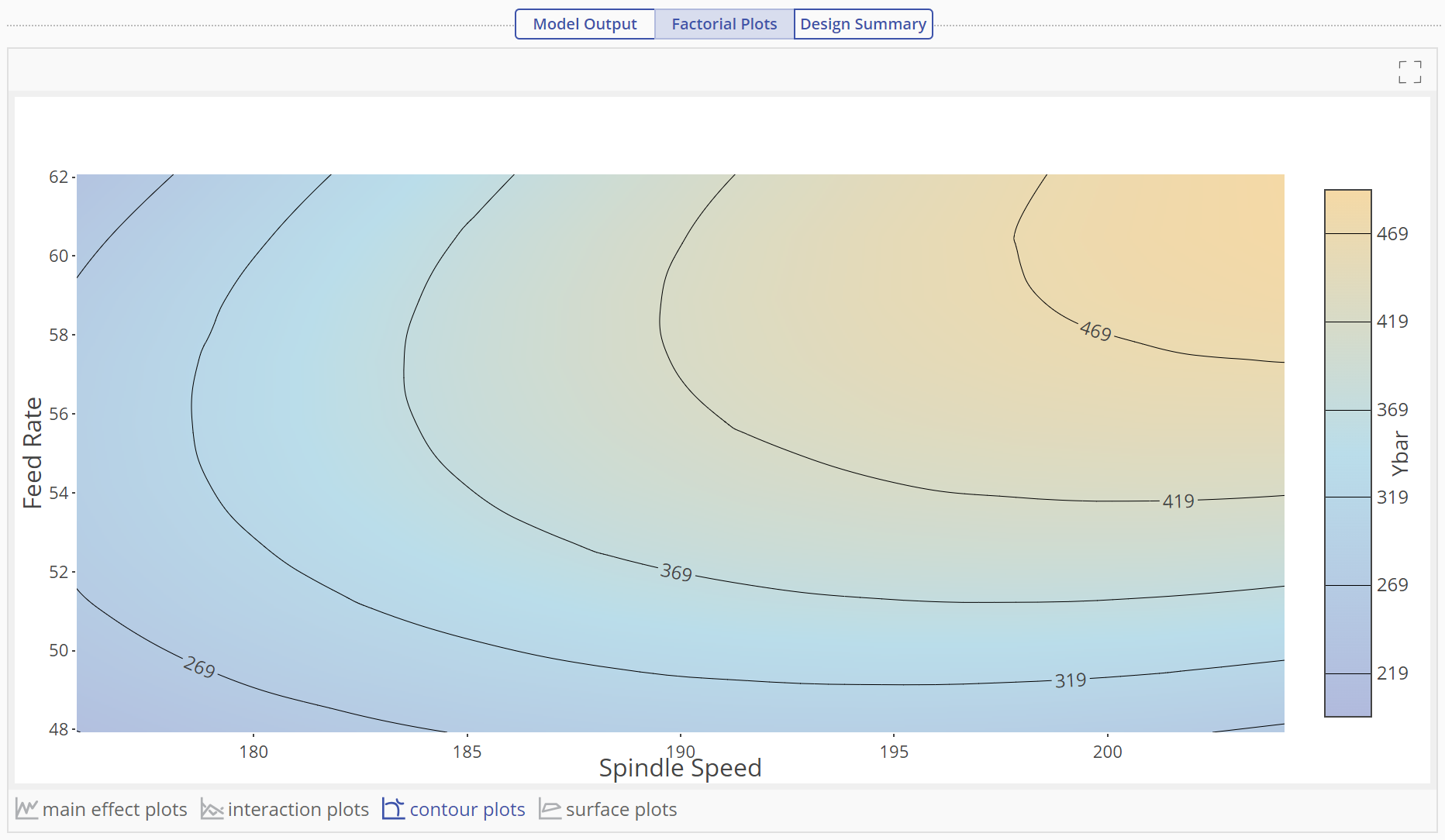
The contours in this plot indicate regions of constant variance for Ybar. The different shades of color indicate height thus, Ybar is maximized in the gold region. Click on the surface plot link to see the 3D surface:
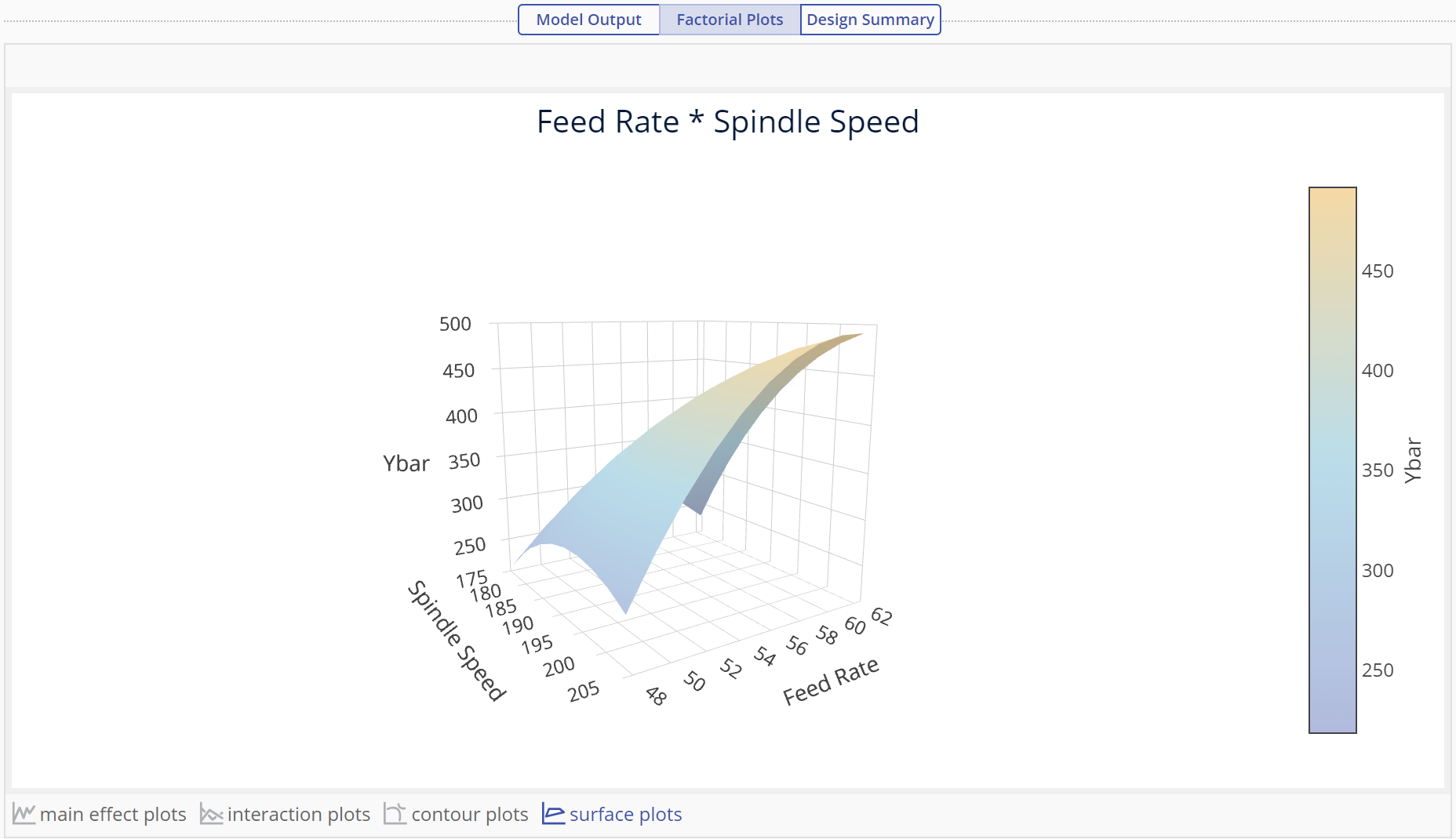
The surface plot shows the same relationship between the independent and response variables as a 3-D graph.
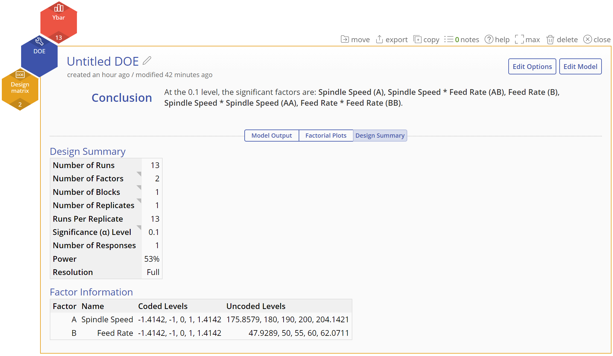
- Design Summary tab
This screen shows a summary of the design underlying the output. Select the Edit Model or Edit Options button at the top right of the study to edit the model further or to change any of your previously selected model selection settings
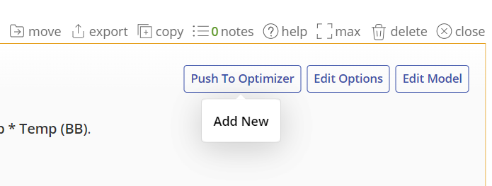
Push to Optimizer
From here you can use the Push to Optimizer button to optimize the output.
1. Click on the Push to Optimizer button on the top right.
Learn more about the Response Optimizer.
Tutorial
Coming soon
Was this helpful?